Trend Charts allow Veeva LIMS users to view embedded statistical process control charts on a given Spec Execution to:
- Compare a batch’s results against previous batch results and determine whether it’s in control or out of trend.
- Analyze stability trending in order to identify regression results that are trending towards an earlier than expected expiration, thus proactively preventing product or process failures and recalls before they become specification failures.
If Trend Charts have been configured by a Vault Admin and defined by a Design Data Admin, LIMS users can view the applicable charts on the Spec Execution record’s Details page.
How to View Trend Charts
In order to view the configured Trend Charts, navigate to the Details page for the desired Spec Execution. As long as the Spec Execution meets the following conditions, the Details page includes a Trend Chart Summary section:
- The Spec Execution has at least one chart defined.
- The Spec Execution has at least one Batch.
- The Batch has both a Material and a Manufactured Date.
In the Trend Chart Summary section, the Chart Alerts card displays the total number of charts that have at least one data point Out of Control (OOC) or Out of Trend (OOT). Click it to view the Trend Charts page.
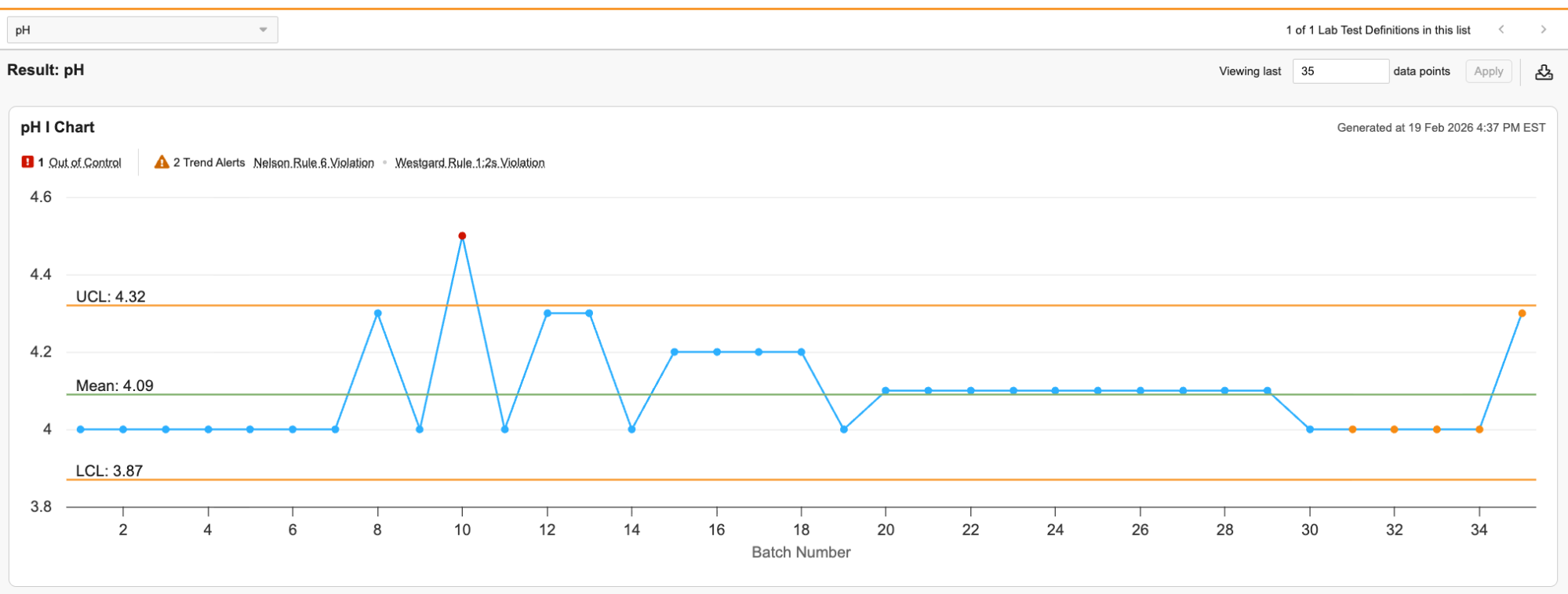
On this page, you can view each chart with a summary of its OOC data points and trend alerts on the top. The trend alerts inform you of any violations of Nelson Rules or Westgard Rules. A dropdown menu in the upper left allows you to navigate between Tests. If a Test has multiple Results, there is a subtab for each Result below the dropdown. You can change the number of data points displayed, up to a maximum of 100, using the field in the upper right.
The title of each chart includes the chart type and the Test it tracks. The X-axis is the Batch in order of Manufactured Date and the Y-axis is the Result data points. If a Batch does not have a Manufactured Date set, it is not included in the chart. You can hover over each data point to view any alerts for that data point as well as a link to its Spec Execution. In addition to the data points, there are lines for the Upper Control Limit (UCL), Mean, and Lower Control Limit (LCL). The value for each of these lines is displayed to a precision of one more decimal place than the Result Definition used in the Spec Execution.
Note: If the Result for the Spec Execution is not complete, the chart displays the text “No chart data available yet.” in place of data points.
The Trend Charts Page for Stability Studies
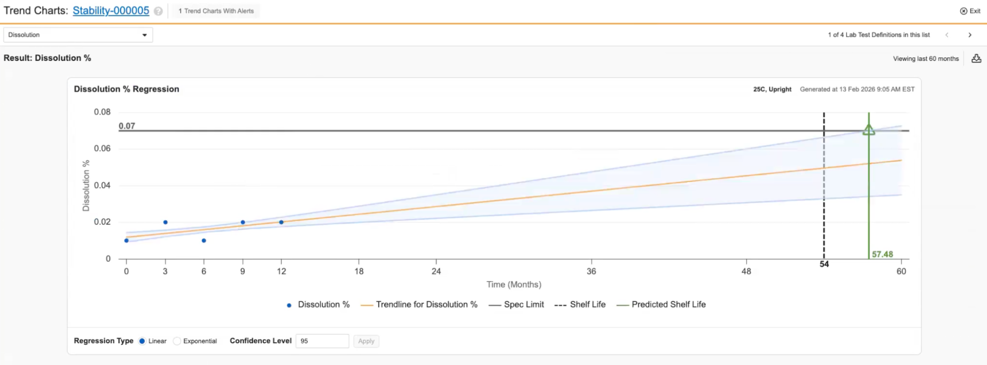
When viewing the Trend Charts page for Stability Study Regression Charts, the layout is similar, but the information displayed is slightly different. The X-axis displays the study’s Timepoints in chronological order (including both completed and future Timepoints) and the Y-axis is the Result data points. The chart displays the Material’s shelf life as a vertical dotted line and predicted shelf life as a solid vertical line. This line is green if it is after the shelf life and red if it is before. If the Material did not have a shelf life set at the time the study was initiated, there is no indicator comparing it to the predicted shelf life and the predicted shelf life is represented as a solid black vertical line. You can change the Regression Type and Confidence Level in the bottom.
To download the analysis, click the Download button in the top right. This downloads an excel file containing a sheet for each chart that includes an image of the chart along with information about the chart, such as its data points.
Note: For non-numeric entries (for example, ND) when LOD/LOQ is configured, the system uses the value defined for calculations (for example, 0, the limit value, or half the limit) to ensure the point can be plotted.
Note: If you select Exponential regression but the data contains 0 or negative numbers, the system displays an error message.
Required Permissions
| Gesture | Permission Required |
|---|---|
| View Trend Charts Action | Execute action |
| Trend Charts Page | View |